
In the world of precast construction, businesses often grapple with time constraints, standardised solutions, and the need for unwavering reliability. Hicrete Precast offers a fresh perspective grounded in advanced engineering and a commitment to purposeful innovation. Their focus on delivering streamlined installations, improving structural integrity, and prioritising safety sets them apart. By consistently meeting these demands, Hicrete Precast paves the way for more efficient and lasting solutions in the industry.
A Modular Identity
When I began designing Hicrete’s brand identity, I drew inspiration from the modular nature of their precast products. The logo is built on a stacked-block concept, suggesting both strength and adaptability—two qualities that reflect Hicrete’s expertise. Clean lines and measured spacing convey precision, while the interlocking shapes highlight how each element supports the next. This motif became the heart of the brand, ensuring every touchpoint communicates Hicrete’s reliability and deep-rooted engineering excellence.


A Purposeful Palette
To underscore Hicrete’s commitment to robust engineering, I chose a near-black as a primary anchor that conveys strength and precision. To energise the palette, I added Cinnabar—a bold accent that stands out without overwhelming. An off-white serves as a clean backdrop, keeping the overall look approachable. Complementing these are subtle greys, which hint at concrete’s industrial character while ensuring a fresh, modern sensibility. Taken together, these shades pay homage to Hicrete’s heritage without feeling overly heavy or outdated.

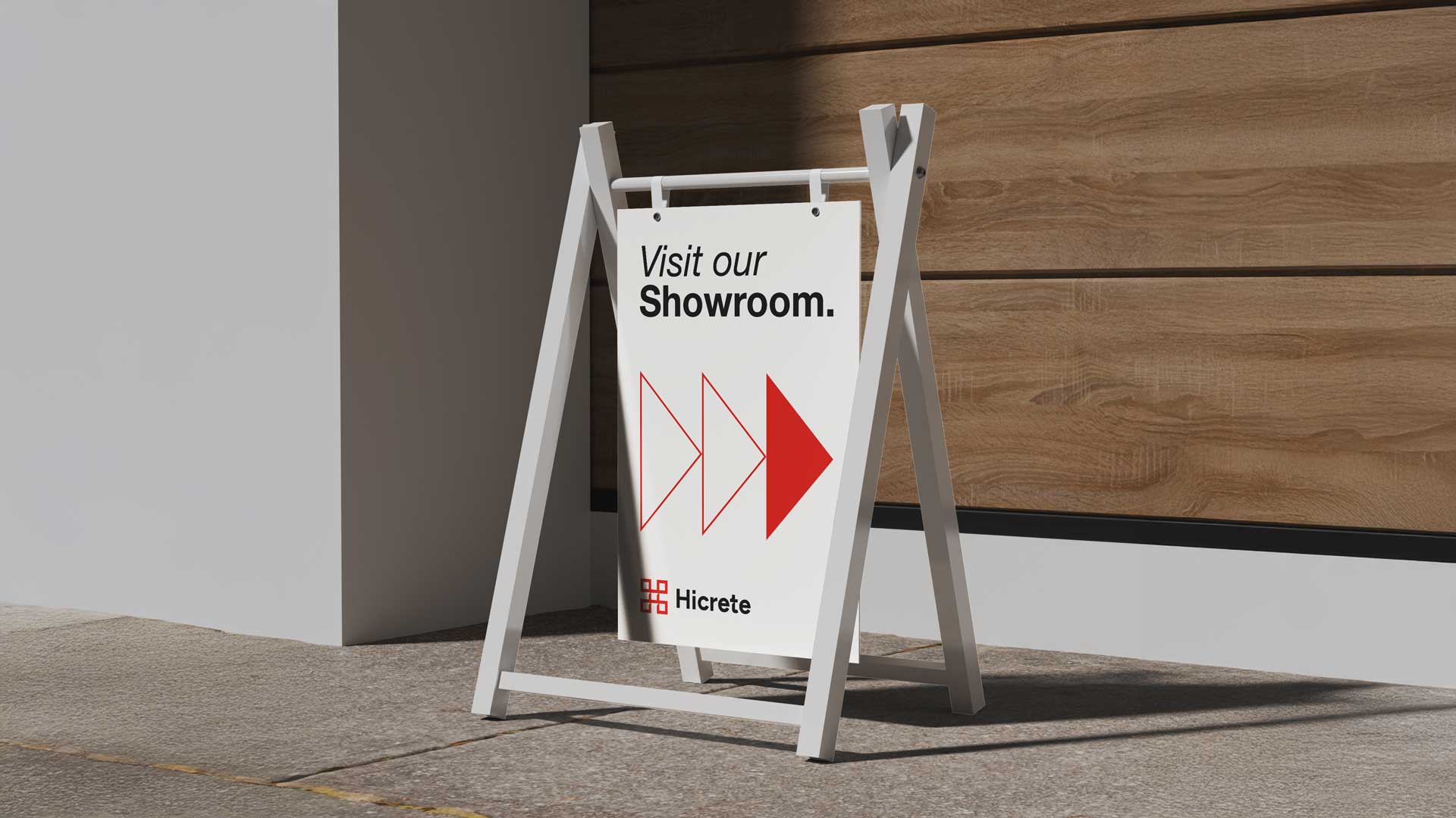
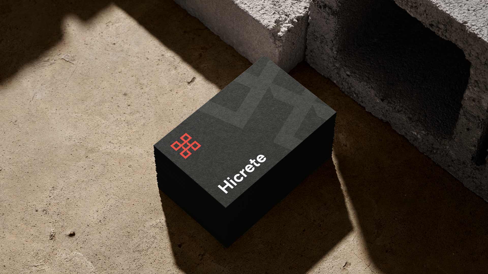
Versatility Across Applications
Building on the stacked-block logo and robust colour palette, I developed a flexible brand system that adapts seamlessly to signage, brochures, and digital platforms. Whether it’s a billboard on a construction site or a business card at a networking event, the brandmark and wordmark remain instantly recognisable. Subtle references to the modular concept carry through all collateral, ensuring that every piece reflects Hicrete’s dedication to engineered solutions.


A Unified Brand for the Future
Ultimately, each element of this identity reinforces Hicrete Precast’s role as a reliable partner in construction. The stacked-block logo, cohesive colour palette, and thoughtful design system all work together to convey strength, precision, and dependability. I’m proud that this brand identity not only elevates Hicrete’s position in a competitive market but also captures the essence of their commitment to delivering long-lasting, high-quality precast solutions.

