
In the world of medical consultancy, businesses often face challenges such as high costs, confidentiality concerns, misaligned incentives, and short-term solutions that fail to create lasting value. Then there’s Dallas Consultancy, a partner that brings fresh perspective, specialised expertise, and a long-term mindset. With a focus on meaningful impact, Dallas Consultancy delivers tangible benefits such as enhancing the patient experience, improving clinical operations, empowering teams through tailored training, mitigating risk, and driving strategic growth.
Built on trust. Designed with purpose.
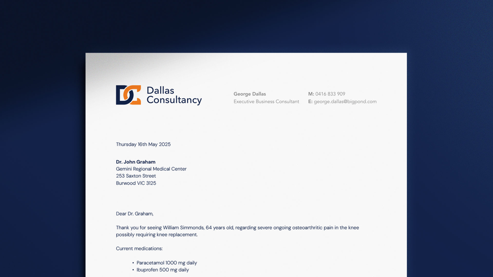
George from Dallas Consultancy approached us seeking a visual identity for his business, having operated for over 20 years without any formal brand representation. Early conversations and a close review of the brief made it clear that relationships are the true currency of consulting — built, nurtured, and sustained over time. I focused my early concept development on the core idea of connection and relationships, incorporating the initials ‘D’ and ‘C’ into the logo mark while maintaining a tone that feels inviting and trustworthy. Steering clear of familiar clichés and leaning into clarity, I delivered a result that is both thoughtful and distinct, reflecting the depth of experience and the relational approach at the heart of Dallas Consultancy.

Linking meaning to form.
After various sketches and iterations, I landed on a concept that felt just right. By intertwining the company initials in a chain-link style, I captured the idea of connection, a core value of the business, while also drawing a subtle parallel to the medical industry by referencing the form of a DNA strand.


Where insight meets instinct.
To further support this, I developed a colour palette centred around 'Blue Zodiac' and 'Tango', complemented by 'Mercury', 'Dove Grey', and white. This combination underscores Dallas Consultancy’s dual nature: professional yet approachable, analytical yet people-focused. Together, they bring balance and clarity to the visual identity, setting Dallas Consultancy apart in a traditionally clinical and conservative industry.


A brand built to connect, and last.
The final identity is more than just a logo — it’s a visual expression of what Dallas Consultancy stands for. Every element works together to reflect the values at the heart of the business: strong relationships, genuine connection, and lasting trust. I set out to create a brand that feels human, credible, and enduring, and in doing so, we gave Dallas Consultancy a visual identity that reflects and reinforces the impact they’ve been making for over two decades.

